Workflow
The ELVTR UI/UX Design Project
required the design of three screens of
user interface based on findings from a detailed player journey and user experience flow analysis. In this project, I created wireframes and mockups for inventory, character select, and title screens based on my analysis of my game of choice, Elden Ring.
Challenges
Short Timeline: 8 weeks from start of research to end of project.
Difficult Task: Find room for improvement in the 2022 Game of the Year’s design, and iterate upon it.
Learn on the Go: Application of concepts as they were learned was core to timely completion of project deliverables.
Work in Constraints: Finished product must function within broader style and context of Elden Ring, and follow it’s style guidelines.
Deliver on Goals: Finished product must improve the user experience of the game through the iterated UI designs.
Progression
Player Journey
Player Journey
From the above analysis, the areas of improvement were discovered, and their iterations below were proposed.
Wireframes
Paper Prototype
UX Flowchart
Mockups
The Player Journey, as well as the rest of the project, analyzed the opening minutes of Elden Ring. Two areas for improvement were discovered:
The title screen was jarringly loud and unpleasantly dark.
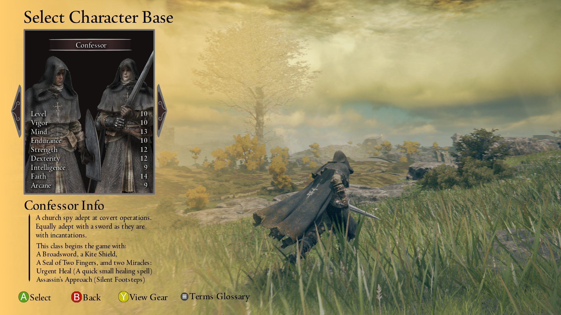
Character select offered precious little information on what playing that character would actually look and feel like, or even who they were.
Accessibility Testing
Paper Prototype and Flowchart
The paper prototype, which was then organized into the flowchart seen here, revealed that hidden in the submenus was a form of equipment menu that could be combined with the existing one’s functionality to create a version that would integrate more seamlessly with the rest of the game’s systems in this flowchart.
Wireframes and User Testing
Wireframes were created to blueprint the three screens chosen for iteration: the Equipment screen, the Character Select screen, and the Title screen.
The Title screen had brightness and volume functionality frontloaded to it, with simple icons depicting chosen brightness and volume settings.
The Character Select screen was redesigned to feature a carousel containing each character archetype and depicting the base male and female versions as the game does, but with added info about starting equipment, character lore, and most importantly a video of character gameplay on which the UI is overlayed.
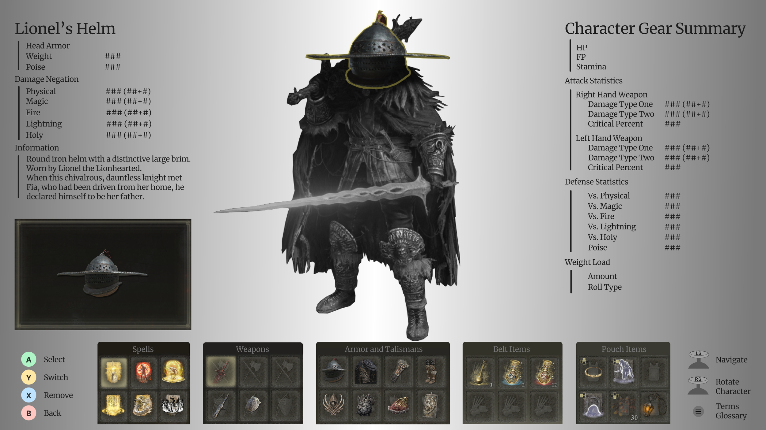
The Equipment screen was completely redesigned to feature the player’s character and their overall build much more prominently. With this layout it becomes possible to parse the character’s capabilities in battle in one glance, while also deep diving into all the relevant details of specific pieces of equipment and how they are adding to the overall build. The screen retains all the functionality it already had in the game, adds a significant amount of functionality and information to the screen, while drastically cutting down on clutter and improving readability.
All three screens went through a user testing and iteration cycle, and were tested with users of wide variance in game experience, ranging from game developers to people who had never played Elden Ring before. Their feedback was incorporated into the final wireframes seen here.
Final Product
Results
This project was very challenging, and very educational.
The final products that I created were the product of a lot of effort, research, and testing. They also went through accessibility testing as was noted in the workflow, and after minor sprite adjustments and spacing edits, they were finished to the quality seen here. I believe that all the goals set at the beginning, for style, functionality, and improvement, were all successfully met. I’m very proud of the work I have done in this class and very thankful to Ivy Sang, my teacher, and Juan Morales, my TA, for all their knowledge, experience, and advice.


